Friday 30 March 2012

3D


I wanted to see what the logo would look like with a slight 3D edge to it like the current channel4 logo. However I don't think it works for this piece. It's distorting the 4 and it doesn't set well. I think the flat graphic works better.

Sign pop


I think I've pushed the logo too far with this idea. I showed John this idea yesterday along with the others. He also thought the logo had been broken up too much. He said this idea could perhaps be used in a few years time after people had become familiar with it. He suggested I use a simpler layout for showing the schedule, possibly something more like what channel 4 do with a split screen.

Thursday 29 March 2012

Chat with John

I had my final chat with John this morning before we broke for Easter. I showed him my Hopper idea, how I bastardised the the logo, the finished logo, pie segment idea, its a wonder life reference, flash Ident idea and other Ident sketches.

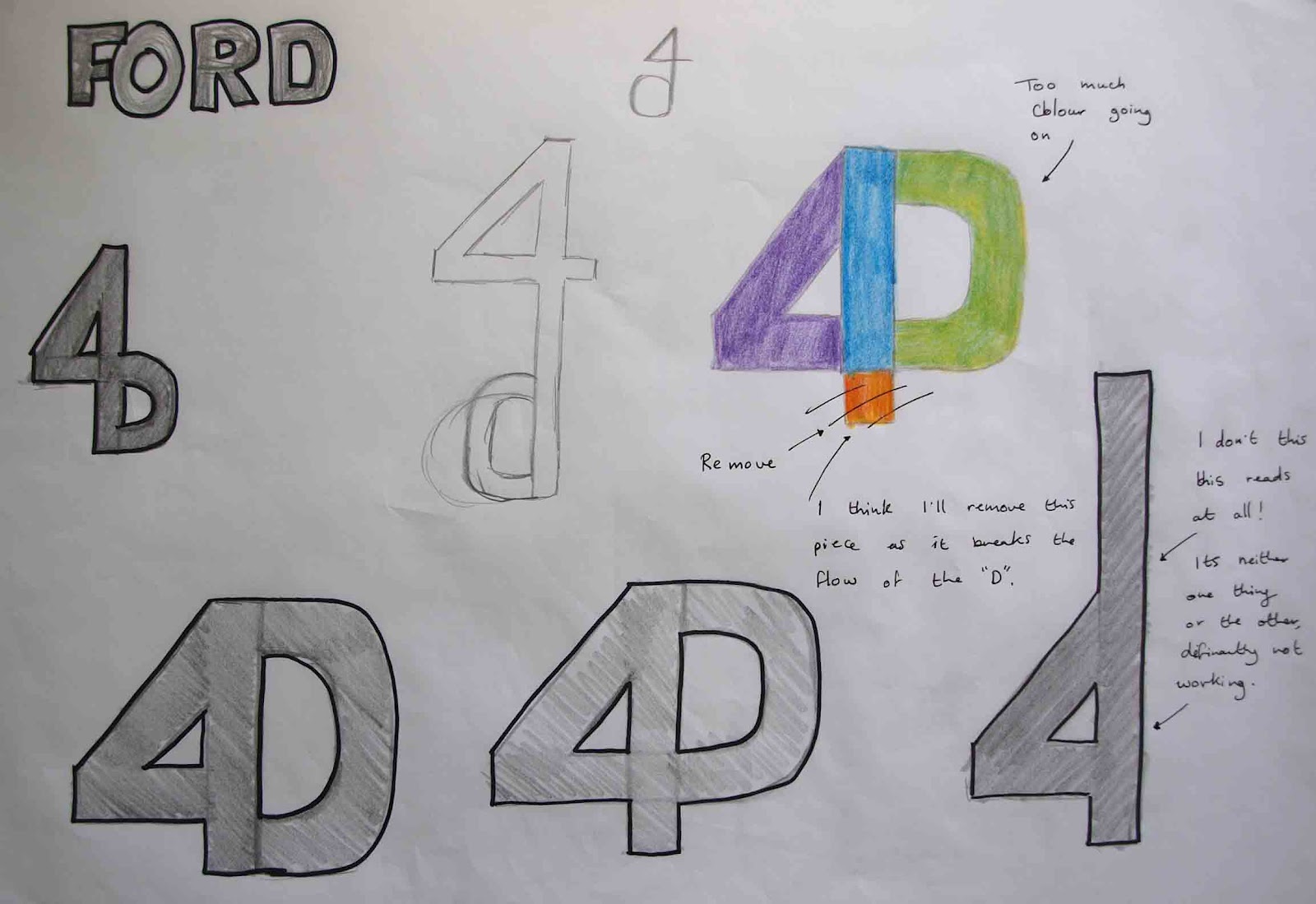
John liked the Hopper idea and thought it would be an interesting way to show off the logo. He thought the newly formed bastardised logo was a lot stronger and had more of a presence than the first version. He still isn't sure about the colour of the logo. When I showed him it along with the other channel 4 logos he thought it was perhaps to similar than the original ch4 logo ( coloured ) as the same colours were used. I used those colours to help link the logos together but maybe its a little to similar. He wants me to work on some more colour ideas and see if it improves to logo.

He also liked the pie idea and the logo being divided into segments which represent the programmes being shown. And he also thought the idea of the segments flashing and having a voice, (like the its a wonderful life) was an interesting concept.

So over Easter John would like me to start developing some of the Ident idea on screen. I will need to experiment with video settings, light, shadow and angle. I will look over the different channel 4/other tv Idents again to see how they have used these methods in different ways.

Wednesday 28 March 2012

Flick and stick Ident idea


Ident ideas


Flash Ident idea


It's a Wonderful life


When looking at the logo the segments reminded me of the opening scene to "It's a wonderful life." The three stars are having a conversation and as they talk the stars flash on and off. I can picture my logo in a similar way. Perhaps the logo could have different voices for each section and as they talk they flash like the stars

Tuesday 27 March 2012

Pie segments


I have showed some of my class mates and friends the list of programmes which may be shown on my Tv channel. I then showed them my logo and asked them to think of it as a pie divided into segments. I asked them to link the programme to the segment which best represented it. This was then summarised and this is what the majority choose.

Finished logo


Colour


Perhaps solid colours could be used for specific programmes e.g. green: film, blue: art, red: documentaries etc. I want to ask people to think of the logo as a pie cut up into sections. I will then as them what section would represent Drama, film, art etc. Perhaps large sections could be used for documentaries as they are usually quite a long show and may be shown over a long period of time. The smaller sections could be used for something like 4thought which lasts around 3-4minutes. So each section can represent an area of what the channel offers.


Hopper idea


This was the idea I had for the Hopper paintings. I would replace the main character in each painting with my 64 logo. I will use the most well known paintings like "gas, nighthawks, morning sun" etc.

Changes made


This logo feels much better now. The lip is more solid and can be seen from a distance which in turn makes the 4 clearer. The slight tilt at has even a nicer lead into the base of the logo, and the 4 is more dominant now.

Bastardising typeface


Impact idea


The impact 6 feels much more solid and really grabs your eye. However the Impact 4 isn't working. It has too many different levels of thickness within it, it needs to be more solid and even throughout. I tried elongating the 6 to see if it helps the 4 set better but it doesn't.

I tried creating my own 6 using Illustrator however its too circular at the top and bottom. I think the Impact 6 is stronger, but I may bastardise it to make it even more solid. I created the "4" shape which works quite nicely and I think it would set well with the impact 6 so I'll try that combo and see what happens.

Monday 26 March 2012

YCN

I've successfully sent of my YCN "i" project, there was a bit of a mix up with sending the information off but they sent me a direct link so it's all sorted now.

I'm going to work on the changes John and the group discussed for the rest on the day.

Review

I showed both ideas (type and number/number) to John and the group to get some feedback. John thought the number logo was stronger. He said the type idea was too long and not graphically strong enough from a distance. He thought the number version had more punch to it, however it still needed some work.

He suggested a thicker "6" which would leave more room for the 4 to breath.


He also asked me to look at the colour pallet and try a number of colours before I settle on one.

Friday 23 March 2012


I've used a mixture of two typefaces, Lucida Sans Unicode for the 6 as it had nice curves, and Consolas bold for the 4 as it was even at all sides and fitted in nicely with the 6.

I think this is more visually interesting than the type idea as its a solid graphic and the two elements set better together. I showed it quickly to some of my peers and they read it as 64 straight away which is great!

I think I could work more on this idea and perhaps make it thicker as I feel the "6" may be a little thin when scaled down.

I'll talk about it with John and the group and see what they think.

Thursday 22 March 2012

Hopper


Library

After my chat with John this morning I went and did some work in the Library. I found a book on Edward Hopper and thought his painting were very interesting. Lots of his work is very well known and iconic. I may be able to use some of his painting to promote my new 64 logo. I'll play around with a few ideas and see what I come up with.

Talk with John

I showed John my logo ideas this morning. He thought some were working better than others and has asked me to continue developing them over the weekend, experiment with colour and show him them again on Monday.

I also talked to him about how the logo would be said on screen. It'll be said in two tones if you can imagine a women's voice saying sixty and a man's voice saying 4.

So it'll be like this:
Woman: Sixty
Man: FOUR! (bang)

Tuesday 20 March 2012

Rough sketches


I thought of trying to break the 64 into syllables. There are three syllables with in the word: 6.T.4. So I tried to play on this with these sketches. However after I continued to look at the design I realised I didn't need the "T" as you read 6.4 as sixty four anyway so the "T" is unnecessary.


Here I have tried just playing with the 64 on it's own. I like the idea of the 4 being concealed with in the 6, however I still want the 4 to be quite dominant so I need to ensure it's large enough and not lost with in the 6.


I also like the idea of using type in the design like more 4 have done. This may help make the 4 become more dominate.

I'm going to work some of these ideas up on photoshop and illustrator for the rest of the day and see what they look like on screen.

Monday 19 March 2012

Plan

I'm going to work on some rough sketches for the new 64 idea. I want to see if type could work within the design like more4 have done. I'll then try and develop these ideas on the mac later.

Typefaces


I wanted to see what typefaces may work with in the design and help me get an idea of the different forms/shapes I could use. 

I like the curve on the 6 of the Ayuthaya reg and Lucida Sans Unicode reg. However I also like the bold typefaces like Impact and Charcoal CY as the thickness is really punchy and eye catching. 

I'm not sure if the serifs are best for this but I'll try it anyway just to be sure. I want the 4 to be even on all sides so typefaces like Britannic bold and Palatino will not work. However I think Consolas, Helvetica and Andale Mono could lend themselves well.

Lyrics


The Beatles

When I looked over my interviews I noticed a lot of people enjoyed listening to the Beatles. So I began to look at some of the Beatles work and came across a song called "When I'm 64."

This sounded perfect for my new channel as the group I'm aiming it at is over 60 and they would also get the link to the Beatles song.

Review

I showed some of my first logo ideas to members of my class. They highlighted concerns which I had myself. They got the idea of what I was thinking, it just wasn't working visually.

Fork
They thought that the "4K" didn't flow well, even when colour was added the shapes didn't seem to form well.

Ford
Had the same problem as the "4K" idea. They said it read a little bit clearer than the fork but it was still difficult to read. They also thought the number "4" should be more dominate.

Form
They liked this idea the best however everyone read it as "M4" and not "4M" as I feared so I will not be using this idea.

Force
Again the same problems were occurring in the "Force" logo. It was too wide and the number wasn't dominate enough.

John
I showed John the logo's and he agreed with the group. He told me to look over my interviews again and see if what some of the people had said could help me. He told me to look at what interested them e.g. music, film and see if this helps me with my design ideas.

Thursday 15 March 2012

Interviews


Interviews

I'm still not feeling 100% and the medicine has made me feel very sick and tired...I just want to go back to bed but I need to keep doing work. I've emailed John and told him I'm just going to work at home today because I didn't feel up for driving. I'll post my interviews from yesterday which went really well, I got some useful information and a better insight to the audience I'm aiming this channel towards.

Wednesday 14 March 2012

Interviews today

I've got my interviews today so I'll type them up tonight and post them tomorrow, wish me luck!

Tuesday 13 March 2012

My tooth got worse as yesterday went on, and I was up all last night with it so I had to have an emergency appointment this morning. The dentist said it was very nasty and had to give me a prescription  so hopefully I'll fell better soon. On the plus side I've managed to arrange all of my interviews for tomorrow. I just hope they will be able to make me out with my swollen jaw lol.

Monday 12 March 2012

I haven't got posting in a few days because unfortunately there was a death in the family and I was helping out at the wake and funeral. To make matters worse my wisdom tooth has swollen up and is really painful hope it gets better soon. I still want to try and do some work because I don't want to fall behind, so I'm going to try and ring some people who are over 60 and arrange a time to interview them, I hope by doing this it will help me design an appropriate logo for the age group.

Thursday 8 March 2012

Force


Form


This is a bit better however I'm worried it looks more like "M4" rather than "4M."

Ford


Fork


I'm not sure how this version looks visually. It may be too hard to see the number with in the "k." I've quickly tried it in a few colours to see if this breaks the shapes up more and allows the number and letter to form easier.

From looking at the dictionary I found words that start with "for" and "four." I then selected the words which were the shortest and fastest/easiest to say.

I replaced the word "for" with the number "4" to see if this would be a clever play on words and numbers, and could also relate to the current Channel4 logo.

I'll try working up some of these ideas and show them to my class mates and also some of the over 60s I interviewed and see which, if any could work.

Talk with John

I had a chat with John this morning and showed him my work so far. He was pleased with the research and I showed him some of my initial ideas which I will work up on paper today.